AppKit vs SwiftUI: Stable vs Shiny
AppKit vs SwiftUI: The Question
When writing a native macOS app, developers need to decide which UI framework to write new code in. AppKit, whose origins date back to 30yrs+ ago, feels like a dinosaur soon to be retired with the shiny SwiftUI waiting around corner to take over.
Ghostty vs SwiftUI
Mitchell Hashimoto has been working on a new cross-platform terminal written in Zig and posted a update on the project’s progress. Notably, he talked about implementing non-native full-screen on macOS:
There is a feature amongst other macOS terminal emulators that is commonly called “non-native fullscreen.”
It turns out implementing this was a doozy. On the surface, it really is very simple: you programmatically modify some window attributes. If you Google around, the code samples to make this behavior happen are a dozen lines or so. But the Ghostty PR was +802/-239. What?
If you’ve been following Ghostty, I very proudly talk about how Ghostty is written in Zig but uses SwiftUI for macOS GUI. Ghostty was 100% SwiftUI (for the GUI): the main entrypoint for Ghostty.app was a SwiftUI App object. The issue is that non-native fullscreen requires subclassing NSWindow and with SwiftUI you just can’t (or, nobody has publicly figured out how).
So, in order to make non-native fullscreen work, we had to rip out the SwiftUI app and window lifecycle management and rewrite it ourselves using plain old AppKit. Note: we still use SwiftUI for the views, just not the window/app lifecycle management.
And it turns out that non-native fullscreen was not the only issue:
If we just wanted non-native fullscreen, this probably wouldn’t be worth it. But, we already had some other bugs or missing features looming because of SwiftUI and this gives us a path to fix all of them, so we decided it was worth it.
So, usage of SwiftUI constrained the product to have bugs and missing features. But why are developers choosing to use SwiftUI if it’s the source of such problems?
To answer that, let’s rewind back to June 2022.
WWDC 2022: The SwiftUI Vision
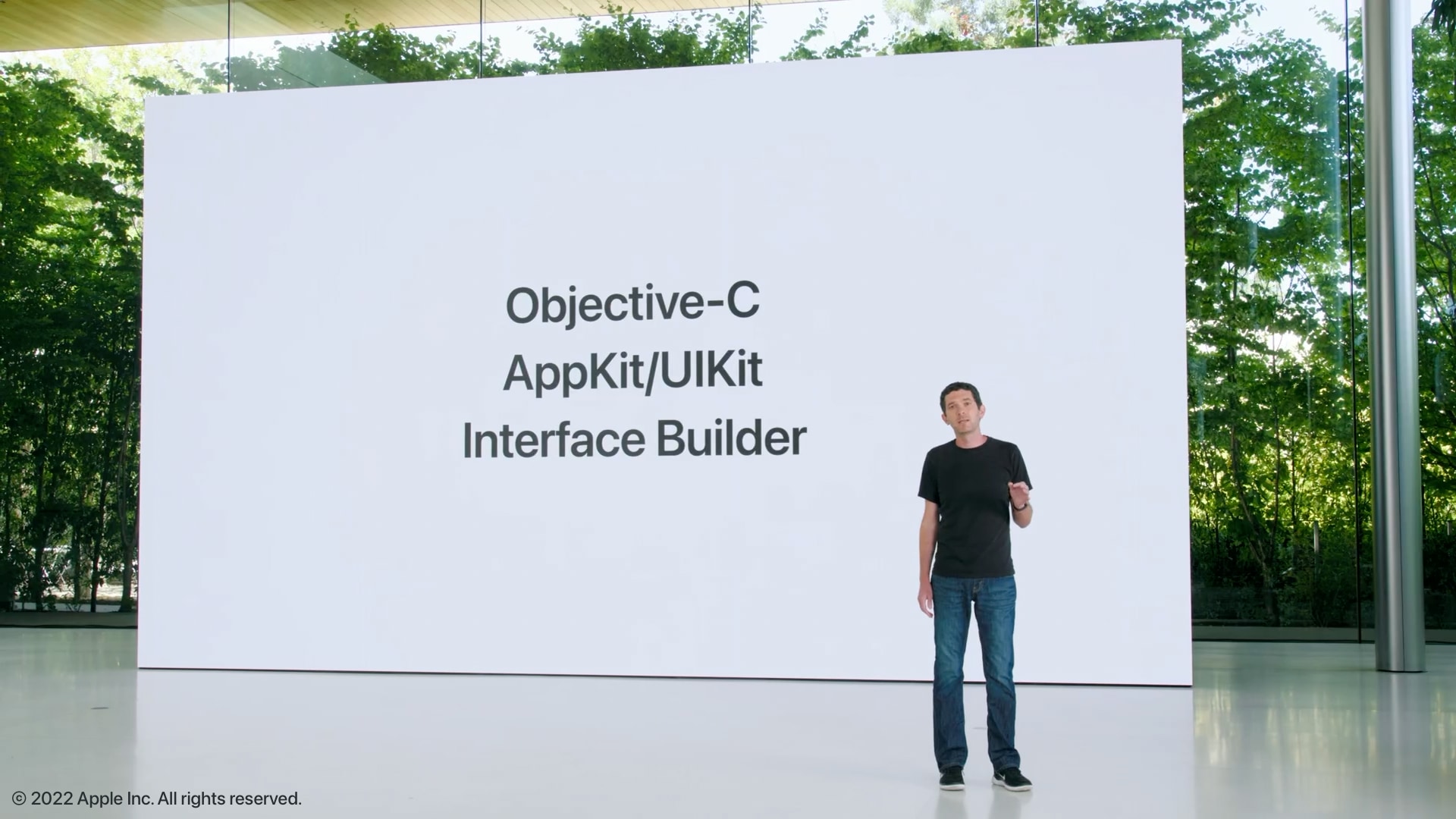
At the Platforms State of the Union session during WWDC 2022, Josh Shaffer set out the vision of the future platforms:
The Objective-C language, AppKit and UIKit frameworks, and Interface Builder have empowered generations of developers. These technologies were built for each other and will continue to serve us well for a long time to come.
But over time, new abstractions become necessary.

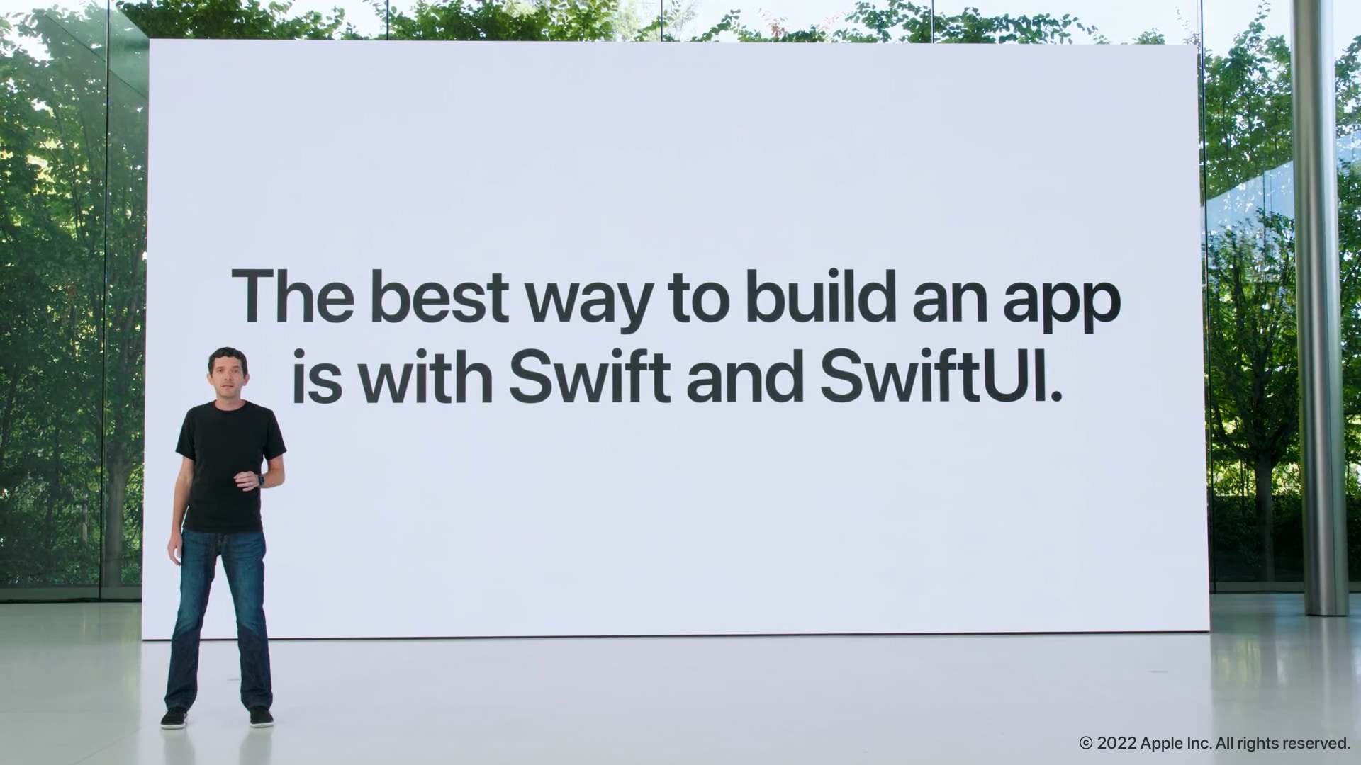
A bit later in the session, he clearly communicated the direction, so that developers know where to invest:
The best way to build an app is with Swift and SwiftUI.

Unfortunately, that might not be quite true on macOS.
Vision vs Reality
It’s important to interpret WWDC statements within the context of the event. Long-term vision statements must to be ambitious & unambigious and as a consequence, they might not match up present-day reality. The evidence certainly supports the hypothesis that SwiftUI is simply not a complete replacement of AppKit today.
SwiftUI: A Thousand Papercuts
The problems with SwiftUI have been thoroughly documented by Michael Tsai, so I’ll include just a few examples.
The app is also hard to develop because we seem to be fighting against a host of bugs and unclear behaviours in SwiftUI on macOS, even in the newest versions.
Another day, another serious SwiftUI bug: List on macOS won’t select its initial value if the binding has an optional value type. Works on iOS, fails on macOS.
I am deeply regretting my decision to use SwiftUI for Big Mail 2.
No macOS SwiftUI component has let me down as much as List. Just when you think you’ve got it working well, there is always some tiny issue relating to reorder, DisclosureGroup expansion, highlight or layout.
Every WWDC from here on in I’ll be looking at from the perspective of ‘can you make better apps with SwiftUI vs not-SwiftUI?’. The answer right now is ‘no’, not for the apps I want to build and the platforms I want to build them for, but boy would it sure be nice to say yes and start using more of AppKit in my cross-platform apps.
macOS Major Versions
It seems that SwiftUI is breaking behaviour across major version upgrades as well. Steve Troughton-Smith on macOS 13 Ventura breaking SwiftUI layouts:
Another version of macOS, another set of SwiftUI layout changes that break my UI in some way.
And sometimes, you get important bug fixes and features which only available on the latest version:
I couldn’t get my SwiftUI view to expand to fill up the entire superview that the
NSHostingViewwas being added to.But, there’s just one problem… this property was introduced in macOS 13 and I’m still targeting macOS 12.
SwiftUI: Case Studies
Another set of data points are case studies of app rewrites and green frield projects. The experiences paint a consistent picture: SwiftUI accelerates parts of the workflow but it introduces non-trivial friction in others.
Case Study: Rewriting Remotion in SwiftUI
Rewriting Remotion in SwiftUI:
Development is faster, the app is more stable, and new teammates are ramping up faster thanks to the simpler code base.
We now think: If you are a macOS or iOS developer who hasn’t yet taken the plunge yet, now is a great time to start writing a new app using almost exclusively SwiftUI, and use its friends Combine and concurrency for the data flow.
While SwiftUI is all you’ll need for a basic Mac or iOS application, there are still quite a few gaps that will require you to partially make use of classic Cocoa views. In our code base, for example, we need some access to NSEvents, text input, and tweaking the first responder that just aren’t possible with pure SwiftUI.
Case Study: Wallaroo and SwiftUI on macOS
Counterintuitively, SwiftUI made hard things and easy things hard:
I was expecting stuff like that to take a lot of effort to get working on the Mac. Instead, it ran 100% out of the box with no modifications at all.
And the stuff that I was expecting to be easy, like a settings view, buttons, and menu commands, turned out to be hard.
And a very common experience for developers targeting both iOS and macOS:
You’re going to have platform-specific code. More than you realize: certainly more than I expected!
Case Study: timing.is
It took a few hours to fall in love with SwiftUI. So much so that we instantly decided to abandon a cross-platform codebase and go fully native on iOS.
Despite the regular friction, we still loved it. Because like any commitment, you must let the majority rule. It was fun at least 51% of the time. But let’s talk about the <= 49% that wasn’t.
AppKit: Maturity & Stability
AppKit is over 30yrs old, dating back to the early beginnings of NeXTSTEP. That’s a very long time to accumulate a set of APIs which been refined over a large variety of use cases. It’s almost certain that any particular feature can be implemented. On the other hand, it’s simply not possible to replace 30yrs+ of accumulated APIs in just 4yrs (SwiftUI was released in 2019).
Because of its maturity, AppKit does not change often nor significantly: it provides a stable foundation to build upon. Desktop OS innovation is quite slow as resources are focused on mobile and spatial. In turn, this means lower likelihood of breaking changes on each major release and more time to focus on your product.
SwiftUI: Solving a Harder Problem
SwiftUI is tackling a much harder problem along multiple dimensions:
-
Declarative: SwiftUI adopts a new declarative paradigm vs AppKit’s imperative. This requires changes to how solutions are expressed and how the APIs are designed.
-
Cross-platform: SwiftUI is designed to be cross-platform across Apple’s OSes. Cross-vendor cross-platforms frameworks suffer from a variety of problems but Apple has an advantage here: it controls the full stack across all environments. Nevertheless, designing a UI framework that can scale all the way from a watch to a Mac is a non-trivial undertaking.
SwiftUI: A Rewrite
SwiftUI can be thought of as a unifying rewrite of AppKit and UIKit, so the usual rewriting caveats, risks and benefits apply.
In this particular case, a major problem is that the developers doing the rewrite are not the same developers who created and evolved AppKit/UIKit. This means that a lot of institutional knowledge and context has been lost and would have to be re-invented.
UIKit (Mac Catalyst)
While using UIKit on macOS is another option, Apple sees UIKit the same way1 as AppKit: an API destined to be replaced by SwiftUI. This is not surprising at all, given that UIKit is an ancestor of AppKit, so shares the imperative nature and having been designed with Objective-C in mind.
Conclusion: SwiftUI on macOS?
To make an informed decision about the UI framework, we need understand what’s driving the decision, what are the use cases and the priorities.
For example, if a product is being built, the question needs to be answered from the perspective of what’s best for the customers. End-users do not care about which framework was to solve their problems. Not fighting a brand new framework will save a lot of time that can be spent focusing on the product itself.
If you want to have some fun, play with a shiny new API or write an app in a new paradigm, then SwifUI is the clear winner here. You will gain important skills that you will be able to leverage in future.
“macOS Apprentice” by Sarah Reichelt
In macOS Apprentice, Sarah tries to answer the same question:
To support old versions of macOS, use AppKit.
For long-form text editing or for thousands of records, use AppKit.
For existing AppKit apps, add SwiftUI gradually.
For everything else, start with SwiftUI and include AppKit as needed.
Final Words
In summary, think carefully about your use-cases and pick the framework that allows you to deliver the user experience you desire.
If you want to provide the best user experience, you might have to leverage the old and rusty AppKit, at least for a while longer. It’s always important to prioritise what’s best for your customers because in the long term, that’s in your best interest as well.
-
As evidenced by the slides from WWDC 2022. ↩︎